Tuesday, 23 November 2010
Tuesday, 9 November 2010
Poster
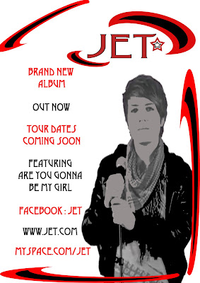
We decided that we wanted to keep with the same red and black theme through out the logo and the digipack. The logo at the top has the same colour and shape as the side borders. The image of me holding the mic shows that the band is all about the music and the costume. At the left side, all the information relates to that of a typical band poster and gives advertisement not only for the C.D. but the tour dates that a band would lined up. Advertising the song 'Are You Gonna Be My Girl' gives an advertisement boost as fans who like that song would be inclined to purchase the whole album. The poster is brought out by the bright colour of the red so that it stands out more however the blacks and the cartoon effect on Nick shows that the band is modern and stylish.

Call sheet
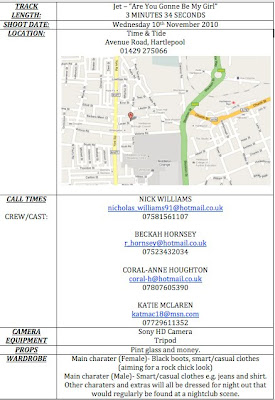
The call sheet shows our plans of where we are going to film, the cast we are going to use, and props and costume. As a group we decided we didn't need a lot of props because our music video is based on people interacting with each other rather than props or symbolic objects. The costume we decided on is the typical attire you would see on a night out and the club is very modern and the type of place that young adults hang out in. We believe it fits in with the mise en scene of the song as it is very modern, stylish and the characters in the video can relate to the young people who would listen to this genre of music.

Subscribe to:
Comments (Atom)


