Tuesday, 23 November 2010
Tuesday, 9 November 2010
Poster
We decided that we wanted to keep with the same red and black theme through out the logo and the digipack. The logo at the top has the same colour and shape as the side borders. The image of me holding the mic shows that the band is all about the music and the costume. At the left side, all the information relates to that of a typical band poster and gives advertisement not only for the C.D. but the tour dates that a band would lined up. Advertising the song 'Are You Gonna Be My Girl' gives an advertisement boost as fans who like that song would be inclined to purchase the whole album. The poster is brought out by the bright colour of the red so that it stands out more however the blacks and the cartoon effect on Nick shows that the band is modern and stylish.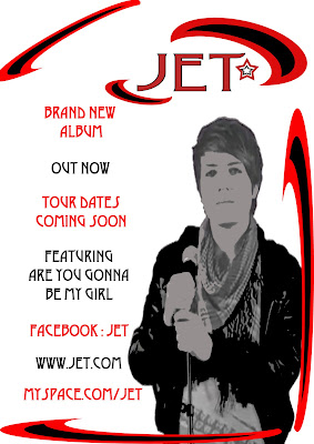

Call sheet
The call sheet shows our plans of where we are going to film, the cast we are going to use, and props and costume. As a group we decided we didn't need a lot of props because our music video is based on people interacting with each other rather than props or symbolic objects. The costume we decided on is the typical attire you would see on a night out and the club is very modern and the type of place that young adults hang out in. We believe it fits in with the mise en scene of the song as it is very modern, stylish and the characters in the video can relate to the young people who would listen to this genre of music.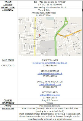

Monday, 11 October 2010
Animatic Storyboard
The animatic follows the story that we wish to do in our music video. We made sure that the timing was all accurate and the shots go with the beat of the music. We believe that this is as accurate as it can be although something we would improve would be the images because sometimes they lack detail. We will be relating back to our animatic and the lyric breakdown when filming to keep on track and to know what we have filmed and what we need to film.
Tuesday, 5 October 2010
Lyric Breakdown
The lyric breakdown shows what we are exactly going to do on each line of the song. This makes it easier for us when we are filming and editing the footage as our group will know where to slot each clip in and will make the lip syncing easier.
Narrative starts with boy and girl ending their relationship and girl walking away, as the pace quickens it cuts to studio to show a band.
Let's go!! Meat shot of singer
Cross cuts between the band in the studio and the crowd in club.
I said a 1,2,3 Quick cuts between three different females
take my hand and come with me Cut to man holding out his hand to lead one of the females away
'Cause you look so fine
And I really wanna make you mine. Goes back to the studio when it gets to the word “mine” cuts back to club. Shows the man leading the girl away and he turns to the camera and winks.
It pans then cuts to the studio
I said you look so fine
And I really wanna make you mine.
Oh, 4,5,6 come on and get your kicks Quick cuts of the club
Now you dont need that money
When you look like that, do ya honey? Goes to a women at the bar ordering a drink till a man comes over and pays for her drink
Big black boots, close up cuts of a female show her boots going up
Long brown hair, cutting close ups going down woman’s hair
She's so sweet Cut zoom in to actress to show facial expression
With her get back stare. Camera tracks away fast
Back to studio to show long shot of band performing
Well I could take, Meat shot of lead vocalist
You home with me, Club toilets, man walks in
But you were with another man, point of view shot of man, showing the girl he likes in a cubicle with another man yeah! Close up of mans face to show emotion.
I know we ain't got, much to say, Studio, pan of band
Before I let you get away, yeah! Cut to club, man walks away, woman follows
I said, are you gonna be my girl? All close-ups of different people, each speaking a different word
Instrumental (10 secs): Point of view shot from last person to show girl he was talking to walk away.
Cut back to studio
Well, so 1,singer 2,guitar 3, drummer take my hand and come with me boy approaches girl,
Because you look so fine medium shot of back of boy, girl looking over his shoulders
And I really wanna make you mine. Girl starts to smile, boy shows relief
I said you look so fine Girl mimes as other girl walks over
And I really wanna make you mine. Other girl hands drink over, boy looks shocked
Girls kiss
Oh, 4,5,6 cuts of studio come on and get your kicks shot of boy showing his reaction change
Now you dont need that money girls pull away, and look at boy
With a face like that, do ya... girl 1 pulls second girl away and boy follows
People dancing
Big black boots, studio, drummer
Long brown hair, studio, guitarist
She's so sweet meat shot vocalist
With her get back stare. Slides to back to club
Well I could see, girl from beginning in garden with new man
You home with me, pull focus to show first man at door
But you were with another man, yeah! Studio
I know we ain't got, man walks towards ex much to say, Girl tries to pull away and man has her pinned
Before I let you get away, yeah! Man pushes nasty man away and scuffle
I said, are you gonna be my girl? Studio, Close up of song
Dipping shots of different couples and scenarios happening in club (28 sec instrumental)
Oh Yeah
Oh Yeah
C'mon
I could see, Band
You home with me, Band
But you were with another man, yeah!
I know we, ain't got much to say, Back to the boys, nasty man walks off and good one helps girl up
Before I let you get away, yeah!
Uh, be my girl.
Be my girl.
Are you gonna be my girl? Yeah! End on girl and boy kissing
Monday, 4 October 2010
Primary Audience Research
To decide how our music video was going to pan out, we needed to do some research so we thought we would do a questionnaire for the public. This would ensure that we make the right decisions for our video. The questions we asked were quite straight forward so it was easier to find out peoples views on their perfect music video.
Please circle your answer
Pop Rock Techno Indie RnB Metal Dance Other
2. On a scale of one to ten, ten being the highest, how important do you think music videos are?
1 2 3 4 5 6 7 8 9 10
3. Which type of music video would you prefer to watch? Tick your choice
A video of the band performing
A video following a storyline which links in with the song
A mixture of the two above
A video that doesn’t relate to the band or the song and is quite abstract
4. Do you prefer songs which are:
Short
Medium
Long
5. Whats your favourite mood of song?
Sad Happy Angry Romantic Comedic Scary Exciting
6. Who do you think the main audience is for indie music?
Children
Yound Adults and Teenagers
Adults
Elderly People
Everyone
7. Do you think music videos help a band sell more records?
Yes
Possibly
No
8. Are you more inclined to watch a music video if you liked the song and the band that created it?
Yes
No
Doesn’t matter to me
Tuesday, 28 September 2010
Tuesday, 21 September 2010
Magazine Advert Analysis

These type of adverts are usually in any magazine especially the ones published music fans, such as NME or Q. This particular advert is for Goldfrapp's sixth album, 'Headfirst'. Their music is usually from the electro genre. The colours used are electrifying and eye-catching. The image on the advert is of the bands female leading vocalist.This creates a visual link for fans of the band and their music. The pastel colours goes well with her pale complexion. The font used to display the band and album names is iconic to the band and has been used on previous albums and singles they have released, this is another visual link.
Tuesday, 14 September 2010
Music Video Ideas
Our 'ideas' sheet was a group effort where we just brainstormed a various amount of ideas and thoughts to what type of genre we would like to use and what style video we should have. We talked about costume, song ideas, costume, location, and the overall music video itself.
Permission for Track
Thursday, 1 July 2010
Lip Sync Task
This is our experience of Final Cut. We have decided that improvements for the final task would be use longer meat shots, to show more lip-syncing, and to sync the lip movement more to the music, to make it more professional. At first I found final cut quite hard to use, but when I used it for a while I then found the software relatively easy to come to terms with.
Shot Count Task
In this video there is 152 shots, however there is not really that many 'meat' shots. This could be because the type of music David Guetta is involved with, isn't about image, therefore he always has another artist featuring which makes them the star of the video. In this case, Kid Cudi is the feature.
Tuesday, 22 June 2010
Album Cover Analysis
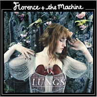
Florence and the Machine - Lungs
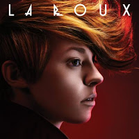
La Roux
Katy Perry - One of the Boys
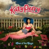
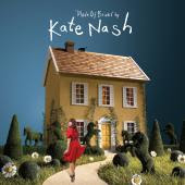
Kate Nash - Made of Bricks
 My chosen album cover which I am going to to analyse is 'Katy Perry - One of the Boys', which incedentily is her debut album. The white picket fence reflects the typical American style dream where everything is glorious and the world is your oyster. The blue sky and white clouds also links with her second album 'Teenage Dream' as its the whole idea of being on 'cloud nine'. The pastel colours used on the album cover also reflects her girly life-style and fits perfectly with the overall genre. However 'One of the Boys' is in blue writing. This is odd as blue is more associated with males.
Tuesday, 25 May 2010
Warhol Image
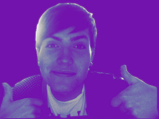
To create my Warhol self image, I took a photo of myself on Photobooth and dragged into Photoshop. I then set the mode to greyscale and set the brightness to +25 and the contrast +55. I created a duplicate image and blurred the image to 3. I then changed the duplicate image to soft light, then created another layer and filled it with the colour blue. To finish, I selected my colour layer and pressed 'lighten' to make the image to stand out more.
My OPIE self
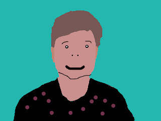
Above is my OPIE self which I created in Photoshop. I done this by using the 'lasso tool' to cut around my features such as my eyes, hair, nose and upper torso. With these I used the right click to select the 'Layer Via Tool' option to create a range of layers to match up to my original photo of myself. The brush tool then allowed me to take extracts of the colour of my features to add to my OPIE self.
Subscribe to:
Comments (Atom)


